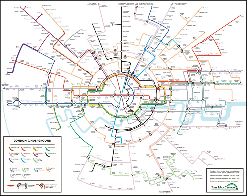
A popular version of the Tube map has been updated by its designer, Maxwell Roberts after a decade. ‘The Circular Map’ was created in 2013 as a bit of “joke” according to the designer and the university lecturer decided to update this version after seeing Transport for London (TfL) use a similar design to advertise mobile phones.
The map, which uses circles to show colour-coded routes for all 11 lines has been a huge hit on social media with nearly two million engagements since it was launched on August 14. The new map includes new overground stations as well as the full Elizabeth line route.


Login to comment
Comments
No comments have been made yet.